Suppose we have a design with a component that contains an image and text, with responsive dimensions and a fixed height to width ratio. The font size scales too, so the text wraps the same for each width.

This is what the HTML structure of the component might look like:
The height of the tile and the font size are proportional to the tile width. How can we calculate them?
What is the width of the tile?
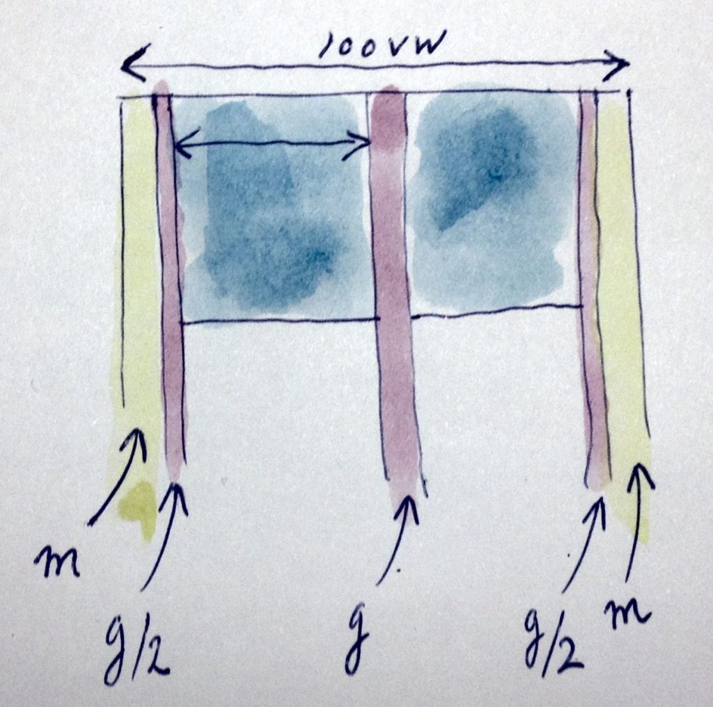
Suppose the tiles are arranged in three columns in a grid that takes up 80% of the viewport width, leaving a 10% margin on each side.

Then the width of a tile can be expressed in viewport width and gutter width:
We could use $tile-width to express the height and position of the tile and its parts, like this:
But $tile-width will likely vary for different layouts/media queries. You can’t use Sass variables outside of the media query that it is defined in. So you would have to set the height, padding-top and max-height properties for every media query.
I would like to use the CSS property font-size to carry the result of our calculations and then set the sizes in em units. So let’s first calculate the font size.
Determine font size
The font size is proportional to the tile width, or in other words font-size equals $tile-width multiplied with a constant, $font-size-factor. If we decide that for e.g. a viewport width of 1500px we want a font size of 18px , using the above expression for $tile-width we find 370px * $font-size-factor = 18px, from which $font-size-factor can be calculated.
That gives us font-size too:
Express tile width relative to font size
Unlike $tile-width we can use the CSS property font-size outside of the media query that defines it. Or at least we can refer to its value: 1em. Since font-size = $tile-width * $font-size-factor we can express the tile width in ems too, as:
That is weird. We calculated font-size based on tile width, and then calculate tile width based on font-size. But in the process we changed from pixel units to ems, and we use 1em as a variable, independent of which media query applies. We now have a constant expression for tile width.
Now we can set the heights of the tile and its parts as follows:
Other layouts
If the viewport is too small, the tiles will stack.


The calculation of font-size for the various layouts is as follows: