With the WordPress Gutenberg editor it is easy to create full-width blocks. We can use them to create rows that span the whole width of a page. Then we can set a background colour or image for that row, while its content aligns with the content of regular (normal width) blocks. This is often used for headers, footers, navigation bars as well as sections that need to stand out.
Prerequisites
We’ll need Group blocks, present in Gutenberg Core since WordPress 5.3. For older versions you’ll need the Gutenberg plug-in.
We will also need theme support for full-width alignment. Check if support is present by examining a Group block:
If the alignment options don’t show up, activate this feature for the theme with the following line in functions.php:
Editing with Gutenberg
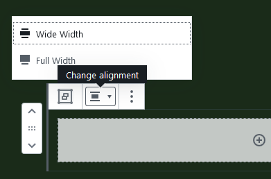
Creating the full-width row in the block editor is now a piece of cake. In fact, we have already done that above for the greatest part.
- Create a Group block
- Change its alignment to Full Width.
The only thing left is to add a class to the Group block to determine the background. You could do this using the color settings of the Inspector controls. Or set a classname manually:
- In the Advanced panel of the Inspector controls, set an additional CSS class
my-full-width-container.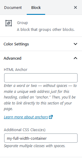
- Save.
That’s it. The rest is styling.
Stretching to full width
Changing the alignment to Full Width basically adds a CSS class alignfull to the block. There are several ways to style a full-width block to make it actually stretch from the left to the right side of the page. Here I will just set the width to the width of the viewport and position the block relatively.
Relative to what?
The calculation of the relative position depends on the margin and padding of the container. In (default) WordPress themes this wrapper often has class entry-content. Suppose we have the following CSS for the wrapper:
Calculate the left property of the alignfull class by just taking minus the sum of the element’s left margin and padding:
That puts the full-width row on the spot where we want it. A problem that may arise is that browsers don’t fully agree whether 100vw is in- or excluding the vertical scrollbar. In Firefox for instance the full-width row would be a little too wide. You might want to add overflow: hidden to a containing element like main to solve this.
Colourful full width
To style the new full-width row, edit the CSS for the class defined in step 3 above.
Align inner container
The Group block very conveniently adds an inner container with class .wp-block-group__inner-container. Match margins and padding of the inner container with those of the regular content blocks, by duplicating the style definitions of .entry-content above for the inner container.
Now child blocks inside the full-width Group block will align with the content in regular blocks.
SCSS version
For completeness here are the styles given above in Sass flavour.